Check out what Lance Mountain had to say in the Zine that was released for the NIXON x Bones Brigade collaboration in 2017, by Sean Mortimer & J Grant Brittain.
LANCE MOUNTAIN ON BB GRAPHICS FOR NIXON WATCHES
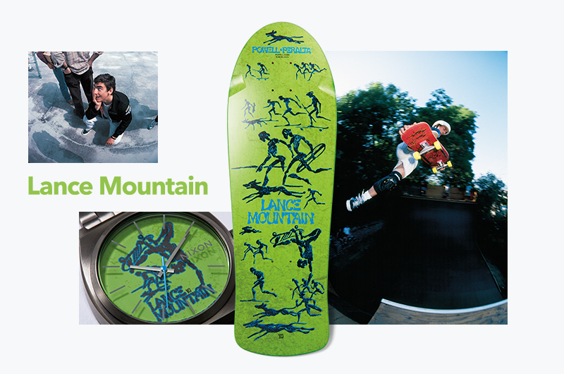
"I wanted Court to draw a coat of arms for my first graphic, but George and Stacy weren't feeling it. I came up to Powell Peralta in Santa Barbara and they sketched this idea of my head with all these ideas blowing up out of it, but I didn't want my face on my board. Then there was talk of a knee bone voodoo skull type of thing … we weren't on the same page.
Then I went up one time and Court was drawing all these Future Primitive character sketches. He had tons of them and they were working towards the Future Primitive video. When I saw them, I told them I liked the idea. Court did the little characters with ink and brush. They were solid ink characters. Then he'd Xerox them up and press wax paper over them and rub it to pull some of the ink off and give it a distressed look. I sat there watching him do it and I've used that technique.
I told him what characters I liked and he collected them and put them on a board. The board was done before I saw it and released and they had used a couple characters I wasn't into. On my very first board they had a weird frog dude doing a layback air and a Tony Hawk character doing a fingerflip. They changed the Tony character into an invert. There was also a Tony Alva character used on a shirt—sometimes you could tell where the influence for a character came from. The second graphic, the one that lasted, flowed a lot more. With my graphic, they struggled with having a central image. That's what their brands was based upon—one strong central image and with this graphic they were breaking out into a different thing.
At that time, Powell boards had always a certain shape and I had the first Powell board with a fishtail. That gave it traction and the graphic was so far away from the other pros' that it gave it even more traction. It was cool because it was very different from what was going on with the other boards.
ON COURT:
I credit George with this and maybe it was based on budget and costs, but he forced Court to draw down from where he wanted to draw, I think. He simplified it. He wanted the lines to be more simple and cleaner and easier to screen and more readable. It forced Court to produce a better graphic than what you have when technology allows you to do more.
I remember drawing a coat of arms for a graphic and they wanted me to draw it. I kept redrawing it and redrawing it and Court kept trying to teach me that every line matters when you draw that way. In normal drawing, if you have a lot of stuff going on, you can have a bunch of lines that don’t matter. The missing part—the clear parts or the solid white parts—are as just as important as the black areas. All those matter so much.
NUMBERS:
I do remember getting a monthly royalty check for $20,000 and they averaged one dollar per board.
RELEASE:
1984—1988
FAV BOARD:
Cab's dragon! Stevie's graphic is just so powerful. I love the Powell logo dragon too.
Finally, part 7 of 7 featuring Rodney Mullen is going up on Tuesday, February 18th.