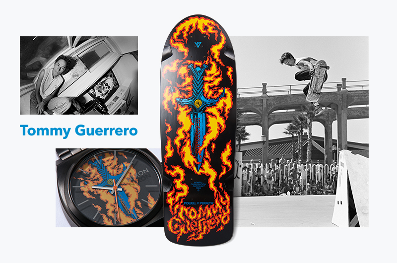
Scroll down to read Tommy Guerrero's words from the zine that was released for the NIXON x Bones Brigade collaboration in 2017, by Sean Mortimer & J Grant Brittain.
Tommy Guerrero on BB graphics for BB watches:
"I started working with Mofo [Thrasher photographer] and the initial graphic idea was the front grill of a hot rod, like a street machine. Mofo had a fish-eyed out photo of some 1930s or 1940s hot rod and the knife actually came from the centerpiece of a grill—that's where the V8 comes from because it was connected to the engine. I was thinking a hot rod street machine and how they raced in the streets. There were always low-riders cruising The Mission on Saturday nights. It was super cool.
Then Kevin Ancell distilled what Mofo had come up with to just the dagger and my idea was to have roses around it and a low-rider street machine kind of thing. My first run of boards actually had that graphic that and I heard George didn't like it. He wanted it changed and that's when Court came in with the Conan dagger and flames.
I was riding for Powell and that was a dream come true so I was just like, 'Whatever you guys want to do.' In hindsight, it was a great call. That board became iconic. People get tattoos of it and show me—I can't believe that. Didn't Andrew Reynolds do a kind of homage graphic? That was crazy.
All these boards became iconic. There are endless amount of skaters out there from the 1980s and to them the boards are a visual representation of their childhood. People come up and show me tattoos, which is crazy. It's pretty amazing to see how connected they are to that graphic.
WEIRD FACT:
I didn't have my license until I was 25.
BOARDS SOLD:
A little over 10,000 boards was the max. At that time vert was still king and I was a newbie on Powell whereas those other guys were heavily established. Think if you could sell half of that nowadays—it was incredible. Most pros don’t even make their minimum now.
DATES: 1987
ON COURT:
Court's graphics were high-level work. He created a style for boards that obviously stands the test of time. They're very iconic images. The idea of a central image being the focus and being so bold and strong with such craftsmanship … I think people underestimate the power of simplicity and restraint when it comes to design. They think, 'More! More is better! Texture! Layers!' But that can just create all this visual noise.
I've always liked clean simple graphics and that is way harder to pull off. That's why everybody keeps adding more shit to any kind of art. 'More is better! I don't know what to do … try this! Just add some more!' Coltrane used to go off these wild fucking tangents for hours and then he realized that what he tried to say in an hour, he could say in a few minutes now. To distill something to absolutely only what is necessary is difficult. Court's obviously got crazy skill.
To this day, people would die to have an artist creating something like that. But, it would have to be something new, not regurgitated. What that is, I don’t know.
FAV GRAPHIC:
Lance's. I always liked the Future Primitive deal. They typography and aesthetic of that made total sense."
Part 4 of 7 featuring Tony Hawk, going up Friday, February 7th.
