Here is Stacy Peralta's text from the zine released for the NIXON x Bones Brigade collaboration in 2017, by Sean Mortimer & Grant Brittain.
STACY PERALTA:
"I had a sense of what the overall Bones Brigade needed to be and I modeled the team after this feeling I had. George [Powell] was the same way when it came to the artwork and the company. He had an overall feeling of the way he wanted things to be—that was his job. Court is an incredible illustrator—an original artist, but it wasn't Court's job to be in charge of the overall look of things. George was guiding Court to fit into this aesthetic that we had created. George was really meticulous about the line quality and the craftsmanship of the drawings.
Court wasn’t like Craig Stecyk [conceptual artist who helped steer Powell Peralta's creative direction] who was in the field. Craig was a skater and at the empty pools with the skaters, but they usually didn't have direct contact with Court because he was based out of Santa Barbara. I would talk to the guys and get an idea of what they were thinking of for a graphic and then I wouldn't take it to Court—I'd take it to George and Court. Court and George were almost like one unit.
Court was already an accomplished artist before George hired him, but George had a very strong hand in Court's work for the company. You would call George an art director in how he worked. George was really into the finely tuned illustration, which Court was a master of. That's why our graphics took so long to be released—George wanted everything perfect. Court was always doing revision after revision after revision.
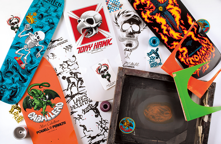
The skull and sword was our first attempt at art. Once that was established and so well received, it became about what's next? It was a complete evolution that we were spearheading, but we were also developing at the same time as we were learning so it was a feedback loop. It was continually going. Prior to that, my G&S pro model just had a G&S brand on it. Who would have thought you could put something like the skull and sword on the bottom of a skateboard? It represented skateboarding aesthetic evolving and growing.
It was the beginning of skateboarding's aesthetic. We were being driven as much by what we wanted as much as what we were seeing being developed before our own eyes. If I'm not mistaken, we were the first company to come out with colored boards and people said, 'You think people want that? You think that will sell?' Something that simple and dumb was really unknown territory. Then you apply a three-screen graphic to that and it's a whole new thing. Art is more important than the name of the company now. There was one time in the office Craig and George and I were talking and we said, 'We have to stop looking at the board as a board and have to start looking at it as a canvas.'
And, it was exciting for the riders too. They started giving input on what they wanted on a board and their graphics helped define their own image. Court's graphics became associated with each skateboarder and became part of their voice. To this day, Tony still uses Court's hawk skull on various projects. It's the definitive Tony Hawk image, which is quite astonishing.
Court stretched himself so much. Court studied cave paintings for Lance's Future Primitive graphic. He did initial sketches over and over and over—he didn't just go into that graphic. He went to the library and got books on cave paintings in France and studied. I'd go into his office and see hundreds of initial sketches—he was trying to immerse himself in that style. That is a very difficult thing to do as an artist. If you look at that graphic, there is a whimsy and an imperfection that does not exist in his skull graphics. He had to bend his shape and develop his shape to succeed in that, which is quite astonishing. You have to give Court so much credit."
Part 2 of 7 featuring Steve Caballero, going up on Friday, January 31st.